How to customize your checkout upsell UI

With Shopify’s new Checkout Extensibility options you can add upsells to your checkout.
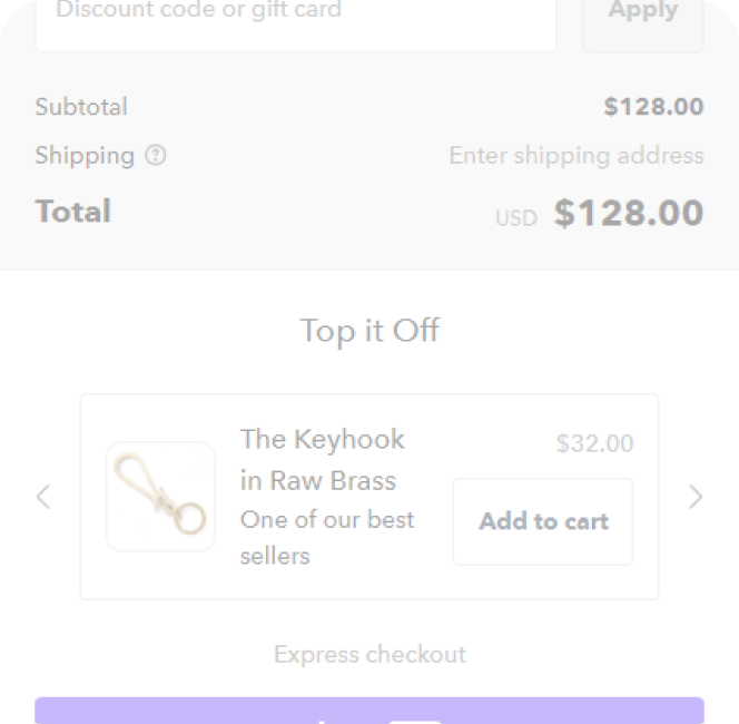
Let’s look at a basic example:

Sure, it does the job, but it’s a bit simple. It wouldn’t blend in with a custom checkout.
Using the UpsellPlus app you can use the WYSIWYG editor to control:
- Upsell card background color
- Upsell card corner radius
- Upsell card border thickness
- CTA button text
- CTA button text color
- CTA button border radius
- CTA button border thickness
- Upsell title
- Upsell subtitle
- Upsell title color
- Upsell subtile color
Using custom CSS under ‘Advanced’ we can go even further and edit:
- Variant selector border thickness
- Variant selector border color
- Variant selector width
- Variant selector text size
- Variant selector text color
- Image size
- Image corner rounding
- Image border thickness
- Price text color
- Price text style
- Price text size
3 examples of how Shopify Plus merchants have used this to customize their checkout:
Schoolyardsnacks.com
Schoolyardsnacks.com has a small, but complimentary product catalog of keto friendly snacks. The founder and CEO, Helen, wanted to show multiple products in checkout to help customers complete their order. This have the customer the ability to see the complimentary snacks at a discounted price.
They used the custom UI, some custom CSS and the Stack layout.

Sauceshop.co
The sauceshop.co has a wide product catalog of bottles of hot sauce. They opted to add a carousel to their checkout, offering three best selling hot sauces. The GBP currency is adopted automatically based on the shopper’s location. They give the customer the option to select the size of bottle with a variant selector.

Glowscrub.de
Glowscrub sells hair removal products in Europe. They wanted to offer shoppers a second item at a steep discount. This fits nicely with the primary beige and secondary black colors of their brand.

Want to style and design your own? Check out our app listing on the Shopify app store.
Curious how UpsellPlus can help increase AOV? Let’s talk.


