Improving the mobile checkout experience on your Shopify store

You’ve probably spent a lot of time making sure your landing, home, product, and other pages are built for all devices. But have you thought about your Shopify mobile checkout experience?
Checkout is the most important part of your website. Shopify Checkout is natively responsive, but it’s not the ideal checkout experience for your business and customers. Plus, if your checkout process makes it harder for customers to complete their orders on mobile, you risk more abandoned carts and missing out on revenue.
Approximately 43% of e-commerce sales come from mobile devices, so you simply can’t afford to neglect your mobile checkout process.
Keep reading to learn the best ways to improve the mobile checkout experience in your Shopify store.
Why you need to upgrade your mobile checkout process
.jpeg)
Did you know that 55% of web traffic comes from mobile phones? If you’re only focusing on your desktop customer experience, you’re alienating a significant portion of your customer base.
As an online business, your customers can come from anywhere. Social media, search results, word of mouth, and other avenues can be the source of your web traffic - and users can access your store from all of them with a cell phone.
When it comes time to close the deal and secure the sale, you need a mobile checkout experience that enables and encourages conversions so that you can take advantage of every kind of traffic you receive.
7 ways to improve your Shopify mobile checkout experience
Just like your desktop checkout, you need to customize your Shopify checkout experience to maximize your conversions and generate more income. Fortunately, Checkout Extensibility helps to make it easy to make changes to your site - especially with the help of a Shopify checkout extension like UpsellPlus.
Edit checkout fields
An optimized checkout experience, no matter the platform, should be as simple as possible and require the least amount of work on the customer’s behalf as possible.
When it comes to mobile checkout, customers are going to spend most of their time entering information slowly with their phone keyboards. You can make it easier for them to complete the checkout process by removing unnecessary fields, like shipping information for digital purchases, and any other fields that add page length. As a result, it’ll take less time for customers to check out and minimize the chances of them changing their minds and abandoning their cart.
Shorten load times
Nobody likes waiting around. As a business, idle time during checkout means more opportunities for the customer to change their mind about completing their order. So, you need to do everything you can to make sure your mobile checkout can keep up with their attention span and not hold back your sale.
You can shorten loading times by limiting the number of elements, including videos and images, that you include on your checkout page. You’ll also want to avoid adding resource-intensive tools or features to checkout so that they don’t contribute to longer load times.
Enable guest checkout
It’s no secret that typing on the phone takes longer and is less convenient than using a computer. When customers are using your mobile checkout, they likely have to enter a lot of information to complete their order - and requiring them to make an account just adds another step to the whole process.
While securing users for your site is helpful, completing a sale is more important. Guest checkout limits the amount of typing and time your customers spend at checkout to help you convert more.
Check styling on multiple devices
Mobile devices, including tablets and other handheld devices, come in a variety of sizes and resolutions. If you want to make your store accessible to every potential customer possible, you need to be sure their checkout experience is positive, as well as desktop and cell phone users.
After customizing your checkout, check the responsiveness of your design on multiple screen sizes so that you can be sure it functions correctly.
Shorten the checkout process
Checkout time plays a major role in the conversion rate of your checkout process. This is especially true for mobile checkouts, as there are plenty of reasons why someone on their phone would have limited time to complete their order.
Shortening the checkout process by limiting checkout fields, cutting down on clutter, and making simple call-to-action elements means less scrolling for mobile users and higher conversion rates.
Offer express checkout options
What’s the best way to shorten the checkout process for your mobile checkout? Autofill the fields!
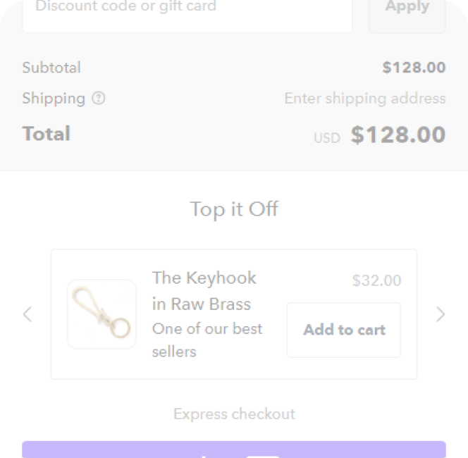
Express checkout is an option that allows customers to use their previously-entered information from other stores (or separate payment accounts) to complete their order on your site. Shop Pay, PayPal Checkout, and multiple other options exist to simplify and streamline the checkout process, helping you to secure more conversions.
Use a one-page checkout
Just like its desktop counterpart, a one-page checkout for Shopify mobile checkout can help to simplify the mobile experience by making everything accessible immediately. Traditional checkouts make you navigate through multiple pages and scroll through empty spaces on each page.
A one-page checkout allows you to place everything in one accessible location that customers can progress through easily to complete their purchases. They won’t have to worry about navigating multiple steps, double-checking their information, or additional load times between pages, lowering the number of clicks it takes to complete the purchase and increasing conversion rates.
Keep an eye on Shopify’s checkout page to see when one-page checkout becomes available.
Make essential checkout customizations with Checkout Extensions Plus

Customizing your Shopify checkout - both for desktops and mobile - is an important element of lowering cart abandonment at checkout. With the right customizations, you can create a better experience that takes advantage of the convenience of mobile shopping to increase your revenue - and Checkout Extensions Plus helps you accomplish that.
Checkout Extensions Plus makes it easy for you to use the new Checkout Extensibility platform to build a custom checkout. Edit, add, and remove checkout fields, add elements, change text, adjust styling, and much more with a single app that applies to all kinds of checkouts.
Get started with a free 7-day trial today.
Curious how UpsellPlus can help increase AOV? Let’s talk.


