7 methods for reducing cart abandonment: key customization strategies for Shopify's checkout

Cart abandonment is an unfortunate part of e-commerce. From window shoppers to dissatisfied leads, abandoned carts account for over 71% of total shopping carts - and they're incredibly frustrating for businesses.
While not every abandoned cart is your fault, it’s important that your checkout page works to avoid being the cause of an abandoned cart. You can accomplish this through a number of methods for reducing cart abandonment, including making physical, stylistic, and informational changes to improve conversion rates - and we’ll show you how.
7 methods for reducing cart abandonment with Shopify’s checkout
.jpeg)
Looking to secure more conversions and reduce cart abandonment? Here are seven effective customizations to make to your Shopify custom checkout.
Streamline the checkout process
When a customer reaches your checkout page with the intention of making a purchase, they’re ready to buy immediately and want it to be as simple as possible. The more that you ask customers to do, the more time it takes to check out - and you’ve got a time limit.
According to recent studies, approximately half of Americans are unlikely to complete a purchase if checkout takes over 30 seconds. The longer it takes to complete their purchase, the less likely a customer is to convert to a sale. You need to do everything you can to streamline your Shopify custom checkout to facilitate fast, easy, and reliable transactions that build customer trust and relationships.
Improving checkout can happen in a variety of ways, including strategies for simplifying, speeding up, and improving the effectiveness of the checkout process.
You can customize your checkout fields to remove unnecessary fields, add new fields to efficiently collect information necessary for a purchase, or edit existing fields to clarify checkout instructions.
You can also implement conversion rate optimization strategies to your checkout page so that your customer’s journey is straightforward and they can complete the necessary actions faster.
Shopify’s newly-announced one-page checkout is another simple way to streamline checkout by moving the multi-step checkout process into a single page for one-click checkouts. Making this switch allows you to minimize loading times, improve information accessibility, and capture customers’ attention to decrease cart abandonment.
Brand your checkout
Your branding is an important part of your customer’s experience - and that extends to the checkout process.
Just like the rest of your site needs to be customized with colors, images, banners, and various styling, your checkout page should also be branded to ensure a consistent experience throughout the buying process.
Checkout Extensibility’s checkout extensions make it easy to make crucial changes to the design of your checkout page. Alongside Shopify Checkout Extensions Plus, you’re able to make changes to colors, design, styling, text, and elements that are part of your checkout page to help you create a unique but consistent brand experience for customers.
Not on Checkout Extensibility? Our Checkout Extensibility migration services help you upgrade to the Shopify checkout of the future while maintaining essential functionality.
Ensure mobile responsiveness
Maximizing your conversion rates and minimizing cart abandonment is about making the checkout process not only possible but easy for all kinds of customers. This includes mobile users, who are often forgotten about when designing a Shopify custom checkout.
Mobile devices account for an exceptional 58% of web traffic and, even more importantly, 43% of e-commerce purchases. Shopify’s checkout is responsive by default, but customizations that you make may not be. You’ll need to be sure you’re styling your content to be easily readable and accessible to mobile users so you can avoid abandoned carts. Optimizing for mobile performance also includes shortening the checkout where possible so that you can stay under the 30-second limit we mentioned above, which can be accomplished by minimizing mobile elements and reducing checkout fields where possible.
Offer express checkout
Checkout time plays a significant role in cart abandonment, so anything that you can do to shorten the time investment required to complete a purchase can help conversions.
Fortunately, Shopify provides a number of options for express checkouts that use information stored in other platforms to complete purchases on your site. Shop Pay, Shopify’s express checkout option, allows customers to enter their information on one site, save it to their account, and reuse it on other Shopify stores without re-entering personal and payment information. PayPal express checkout also enables shortened checkouts using saved information in PayPal which greatly accelerates the buying process so that you can be more effective at converting.
Include trust elements
Trust is an essential factor in e-commerce conversion rates. The faceless and impersonal nature of online shopping makes it harder to gain the trust of new customers before you’ve been able to prove yourself with order fulfillment, which can lead to abandoned carts.
Trust elements help to reassure customers that they can trust your store and encourage them to check out at a higher rate. Review, testimonials, and security badges are just a few ways to demonstrate that your business can be trusted with personal and payment information as well as qualify yourself as the right store to purchase from.
Reviews are an especially effective form of social proof that helps to drive conversions, as 84% of people say they trust reviews as much as personal recommendations and consult them before completing a purchase. The inclusion of positive reviews or testimonials at checkout can put customers’ minds at ease.
Be upfront with pricing
Nobody likes to be surprised when it comes time to buy the product they’re excited about. Customers have an expectation of what their item will cost before even reaching the checkout process, so if you add on additional fees at the end of checkout, customers may feel misled and abandon their carts as a result. This feeling is responsible for as many as 48% of abandoned carts.
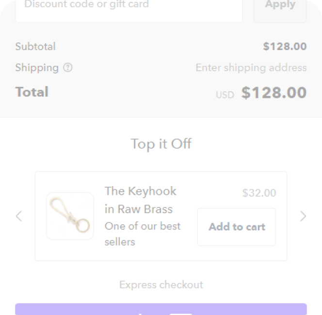
One way to minimize abandoned carts is to be upfront with pricing and costs throughout the whole checkout process. Shopify allows you to include the order summary throughout each step of the process, so be sure that your fees are being added as they apply. It also helps to set expectations for additional costs like shipping costs or fees as early as possible so that customers can take those costs into account and never use hidden fees.
Answer FAQs
Once your customer reaches checkout, your goal is to keep them there until they complete their purchase. If they leave, your conversion rate optimization strategies become less effective, and the chances of completing the sale go down.
One reason customers may leave checkout is to check for shipping, return, or other important information on your site to reaffirm their purchase. However, you can include the most pressing FAQs at checkout to stop them from leaving, allowing you a better chance at earning a sale.
Checkout Extensions Plus: Shopify checkout customization made easy
.jpeg)
Customizing your Shopify checkout page with Checkout Extensibility can be intimidating, but with the right Shopify checkout extension, you can make crucial changes that help reduce cart abandonment.
Checkout Extensions Plus provides a simple and easy-to-use interface that allows you to make changes to your checkout page without any prior coding experience required. Adjust styling for text, add custom elements to your pages, add or remove checkout fields, and brand your page using the Branding API to ensure a consistent but unique experience at checkout.
Start reducing cart abandonment today with a 7-day free trial for Checkout Extensions Plus.
Curious how UpsellPlus can help increase AOV? Let’s talk.


