The new Shopify one-page checkout: how to upgrade

Shopify is always working to improve and expand their platform’s checkout process. The ongoing upgrade from checkout.liquid to Checkout Extensibility is one of the most recent steps they’ve taken towards making it easier than ever to build a high-converting checkout process. But there’s another new development coming alongside Checkout Extensibility becoming the new standard: a Shopify one-page checkout system.
Keep reading to learn more about this upcoming feature and how to get in line for an upgrade.
What is Shopify one-page checkout?

A one-page checkout in Shopify is just what it sounds like - a single page for customers to complete their orders with. While traditional checkout processes have multiple pages for customer information, shipping, payment, and other steps, one-page solutions combine all of those elements into a single page.
The primary purpose of a Shopify one-page checkout is to speed up the checkout process to improve conversions. With as many as 17% of customers abandoning carts due to long checkout processes, anything that can cut precious seconds off of the process has the potential to raise conversion rates and generate more revenue.
In some cases, a one-page checkout may also be called a one-click checkout due to the “place order” button being the only button required to complete the purchase. This is also why options like PayPal and Shop Pay express checkout are so popular - immense time savings.
One-page checkout is made possible by the new Checkout Extensibility upgrade that allows for app-based extensions that make it easier to customize your checkout without editing code, like Plus Checkout Customizer.
Is a Shopify one-page checkout right for me?
With the introduction of Shopify’s new one-page checkout system, stores are going to have a simple and effective way to upgrade their checkout. But, is a one-page checkout process always better? It depends.
By putting all of the checkout steps in one place, you lessen the number of clicks required to complete a purchase and limit loading times so that customers don’t have enough time to change their minds. A one-page checkout for Shopify also prevents customers from being surprised about shipping dates or times after they’ve already entered their information, minimizing the chances of them feeling misled.
However, a Shopify one-page checkout requires more customization to provide the best customer experience possible. When you put all of the checkout steps in one place, it can get crowded and take attention away from the most important elements. So, you’ll need to implement effective conversion rate optimization strategies at checkout to see the best results.
As a result, one-page checkout for Shopify may work better for some companies than others. Stores that don’t require a lot of information, such as digital goods stores, are able to remove some of the checkout fields to reduce the chances of a cluttered interface. However, stores with additional elements like a calendar scheduling app may struggle to fight for real estate on customers’ screens.
On the bright side, Shopify will allow you to test both types of checkout and choose which is best for your store, so you don’t need to make a final decision right away.
How to upgrade to one-page checkout for Shopify

Unfortunately, Shopify’s one-page checkout experience is not currently available to the public. You are able to apply for early access, but there’s no guarantee that you’ll be accepted and there isn’t a launch date for this new feature.
However, due to its close relation and dependence on the new Checkout Extensibility checkout process, it’s likely to be rolled out to Shopify Plus stores first due to their ability to upgrade sooner than the public.
To opt-in for the one-page checkout upgrade from Shopify, click here. You can also get a preview of a Shopify one-page checkout system in use by visiting the Shopify Supply store.
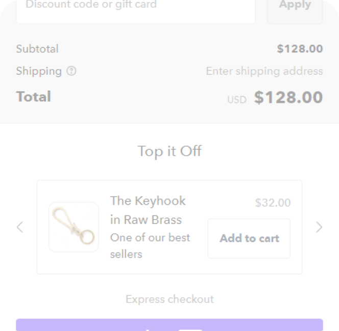
You’ll notice that the page becomes very long in Shopify’s example, but your checkout will be able to be customized to the orientation and layout that works best for you. It’s also very mobile-friendly, and all Shopify custom checkouts are optimized for mobile to ensure you can serve customers on all platforms.
If you can’t wait until the official release or aren’t a part of Shopify Plus, there aren’t many other options for you to consider. Shopify doesn’t allow alternate checkouts, so any third-party apps that offered the ability to create your own one-page checkout is no longer an option to consider. You could still create your own custom one-page checkout by editing the checkout.liquid theme file, but this would be a resource-intensive and time-consuming process to complete even for a developer.
In the meantime, consider implementing effective strategies for improving your checkout’s conversion rates and your average order values like adding an upsell at checkout or post-purchase pages.
Make your Shopify one-page checkout better with UpsellPlus
Whether you’re still using checkout.liquid or have upgraded to Checkout Extensibility, UpsellPlus can help upgrade your checkout page. Plus, it’ll work with one-page checkout as well, allowing you to grow your AOV no matter the platform or checkout style you choose.
UpsellPlus is your upsell and cross-sell app for Shopify. It makes it easy to build effective upsell and cross-sell offers that can be placed anywhere in your checkout process so that you can maximize your revenue and grow order values. With AI-assisted bundling and product recommendations, you can use real customer data to help determine what offers to make for each product. Custom logic ensures that all offers made are relevant and A/B testing helps refine your approach so that you can enjoy more conversions.
Get started with a free 7-day trial today, and get help upgrading to Checkout Extensibility so that your checkout can be future-proof and ready for the release of Shopify one-page checkout.
Curious how UpsellPlus can help increase AOV? Let’s talk.


