Unveiling the pros and cons of one-page checkout and multi-step checkout

Checkout is an essential step of your sales process. Your conversion rates control how profitable your business can be, so optimizing your checkout is one of the most important customizations you can make.
Shopify’s new one-page checkout feature is coming soon which will allow you to offer a different customer experience. With the ability to use a one-page Shopify checkout for the first time, you’ll have more options to consider for making the most of the checkout process.
Keep reading to learn whether a one-page checkout is right for you.
One-page Shopify checkout
.jpeg)
A one-page checkout works to combine all of the steps of a standard checkout into one single page. From this screen, you’re able to enter personal, shipping, and payment information before completing the order.
Pros of Shopify one-page checkout
Straightforward checkout process
Customers like checkouts to be as simple as possible. The harder it is for them to complete checkout and finish their purchase, the more likely they are to lose trust and abandon their cart.
One-page checkout for Shopify makes navigating the checkout process as simple as possible. The requirements, cost, and shipping information are accessible from the start, and there’s no downtime in the process. Just fill out the fields, enter payment, and confirm the order.
Less loading
Nobody likes waiting. If your checkout process has customers waiting for loading screens - especially at the checkout process - you risk losing their attention and increasing the chances of an abandoned cart.
With a one-page checkout, there is no loading screen between steps. You can complete the entire transaction on a single page to avoid unnecessary waiting around.
One-click checkout capability
Research shows that the fewer clicks it takes to complete a purchase, the more likely a customer is to convert.
Without multiple pages to navigate through, customers can enter their information and press a single button to place their order.
Upfront checkout information
Transparency is important to customers during the checkout process. If your customers go to checkout and the cost is much different than they expected, it hurts trust and increases the chances of an abandoned cart.
When you use a single page for your checkout process, all of the information - including pricing - is available immediately to avoid surprises.
Cons of one-page checkout for Shopify
Less conversion information
Checkout is an information-rich step of the sales process. With the right data tracking setup, you’re able to see where customers are abandoning their carts so that you can refine your strategy to increase conversions.
With a single checkout page, you have fewer data points to reference to see where you’re losing customers. It’s much easier to track abandonment on a step-by-step basis than per checkout field.
Screen cluttering
Your checkout needs to be as clear as possible so that customers know how to complete their orders. You also need to be sure you’re highlighting all the important elements of your checkout including upsells and the “place order” button that secures the conversion.
A Shopify one-page checkout requires additional effort into conversion rate optimization to ensure you’re not overwhelming customers with the amount of information on the page.
Multi-step Shopify checkout
Multi-step checkout is the default option for Shopify checkouts. It includes 3 steps: customer information, shipping, and payment.
Pros of multi-step checkout
Plenty of room
Multi-step checkout for Shopify has the benefit of using 3 screens to display all of the necessary and relevant content that’s part of your checkout process. With 3 steps, you can avoid cluttering the checkout page and easily draw attention to the important elements, making conversion rate design a bit easier to implement.
Conversion information per page
When it comes to optimizing your checkout process, analytics can go a long way towards helping figure out what needs refining to help maximize conversions. With a multi-step checkout and tracking pixels, you’re able to tell which step of the process a customer abandoned their cart on. Using this information, you can determine if your shipping rates or times are too high, if you’re asking for too much information, or if your payment methods aren’t sufficient for your customers.
Step-by-step information verification
In addition to providing more room to display your information, a multi-step checkout page also makes it easier for you to review all of your entered information. With fewer fields to look over at each step, you can double-check that everything is correct before confirming the purchase.
Cons of multi-step checkout
Multiple clicks to purchase
The more a customer has to do, the harder it is to convert them. When you use multiple screens to collect information, you ask the customer to click more often and navigate multiple pages. Each click is another opportunity for them to get frustrated and abandon their cart, and reduces the efficiency of FOMO for things like upsells.
More loading times
Similar to requiring multiple clicks, a multi-step checkout process also adds waiting time as customers switch between screens. If your site isn’t fast enough, the checkout steps can add precious seconds that give potential customers time to second-guess their decision to buy from you.
Is a one-page Shopify checkout right for you?

Now that you know the pros and cons of a one-page checkout for Shopify, you’ll need to decide if it’s something that would work for your business.
Online stores that are exclusively digital, require less personal information, or don’t have additional checkout elements like scheduling would be ideal candidates for a Shopify one-page checkout. With fewer elements to add, you can reduce the risk of cluttering your pages and provide a simple customer experience.
If your checkout page has a lot of elements to it, including customizations or scheduling, your checkout page may get too cluttered to be effective. Multi-step checkout may also be a better choice if your business is still working on refining your payment methods and shipping processes so that you can benefit from customer tracking.
Add UpsellPlus to any checkout page for increased AOV
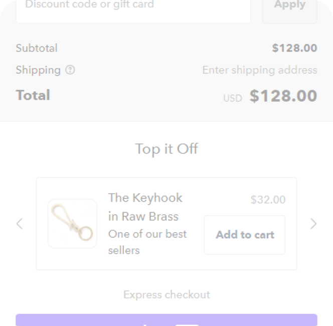
No matter which checkout format you choose, no checkout process is complete without the addition of upsells and cross-sells.
UpsellPlus helps you to build effective, high-converting upsells that can be added to any step of checkout, including cart, checkout, and post-purchase pages. Choose from multiple locations based on customer data and A/B testing to put your offers in the best position to be accepted and use AI-assisted product recommendations to make sure your offers are always relevant to your customers.
Best of all, UpsellPlus is compatible with all Shopify custom checkouts, so you can benefit from upselling and cross-selling no matter what format you choose.
Get started with a 7-day free trial today.
Curious how UpsellPlus can help increase AOV? Let’s talk.


